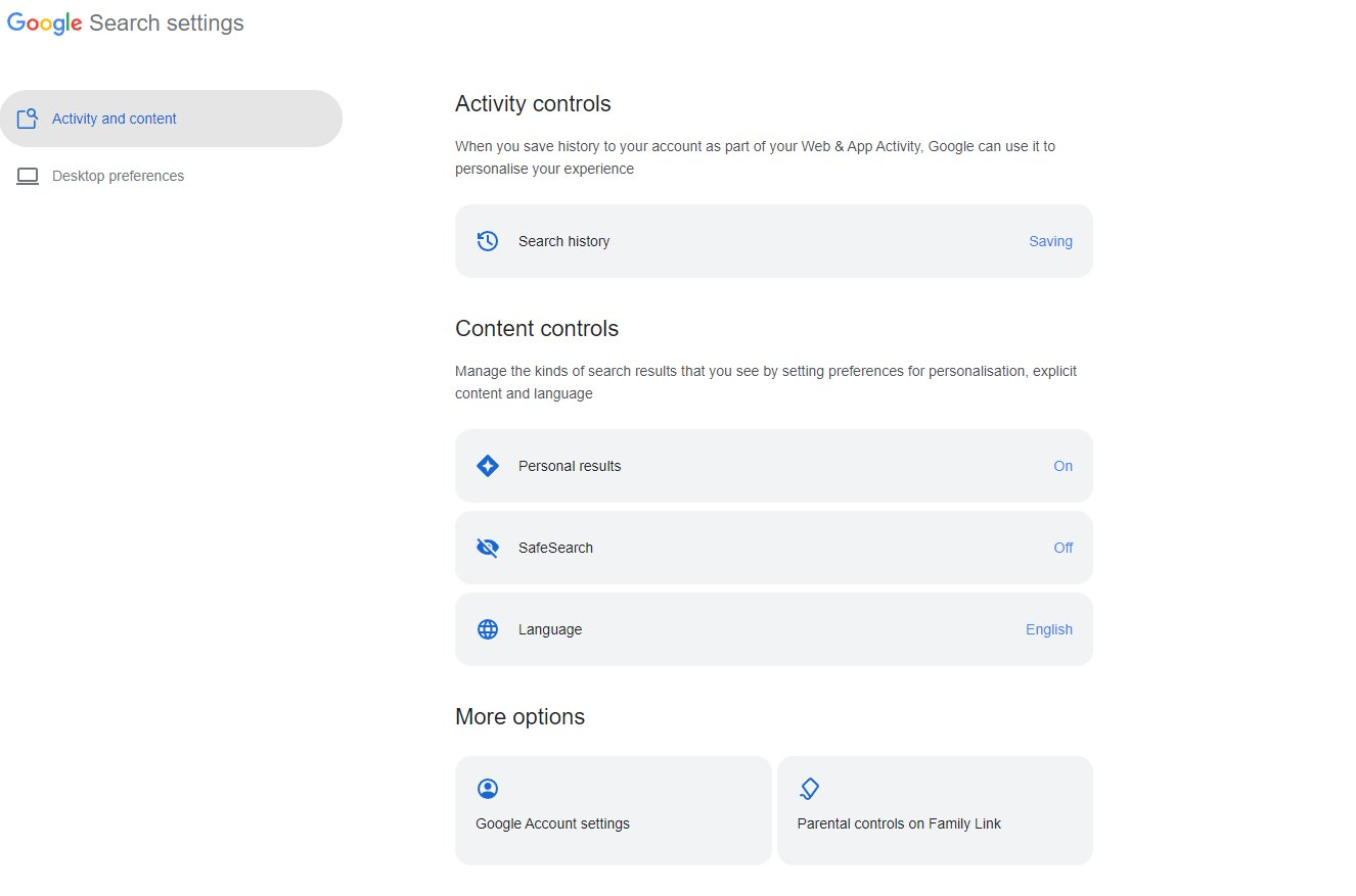
New Google Search Settings Design
Since last week, Google has been rolling out a new search settings design interface. It looks more like the material design interface, with rounded and shaded borders. This is compared to the more bland textual look for search settings.
I had a few people share it with me last week (I can't seem to find it now) but Khushal Bherwani shared screenshots of the new design with me yesterday on Twitter, here is that screenshot:

Here is what I see:

Here are more screenshots:
🆕G with new dashboard for setting preferences in Search settings
— Khushal Bherwani (@b4k_khushal) May 15, 2023
cc - @rustybrick pic.twitter.com/v6gi5dxkqJ
Do you prefer the old or the new design for Google Search settings?


0 Comments